
Before I get into dispelling myths about sRGB, I’d like to shed a little light on what an sRGB color profile is and what it does. Surprisingly, even many photographers don’t seem to fully understand how ICC color profiles work – I was one of them for many years until I recently questioned whether using Adobe RGB was really the way to go. I found myself constantly having to convert from that color profile over to sRGB just to get image color to render correctly on many websites. After years of frustration, I finally decided to get my hands dirty, dig deep, and find out what was really true.
Want to say thanks for an ad-free, subscription free experience and top-notch content?
Understanding ICC Color Profiles
ICC color profiles provide information to a device such as a printer or monitor about the range of colors an image was captured in -or- as Wikipedia puts it:
A color space is a specific organization of colors. In combination with physical device profiling, it allows for reproducible representations of color, in both analog and digital representations. wikipedia.org
When it comes to universal color accuracy, there’s really only one color space – sRGB. However, loads of other companies have developed color spaces for specialized applications. A few of the better know color spaces include:
- sRGB (created jointly by HP and Microsoft in 1996, later standardized by the International Electronics Commission (IEC) and currently maintained by the International Color Consortium (ICC)
- Adobe RGB (created by Adobe)
- ProPhoto RGB (created by Kodak)
- Wide Gamut RGB (created by Kodak)
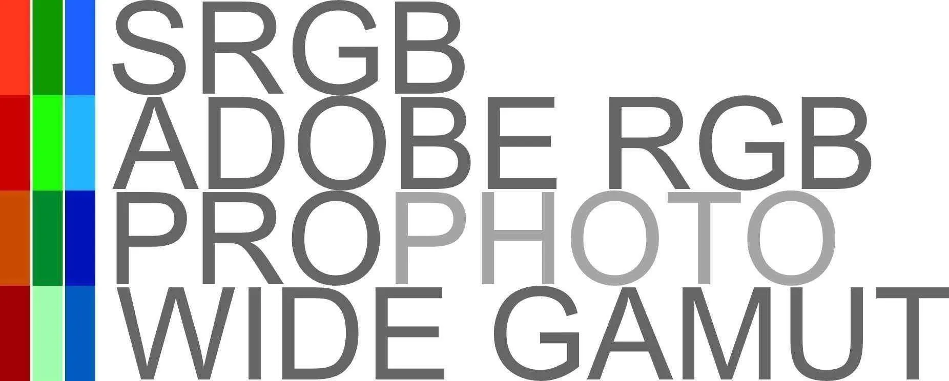
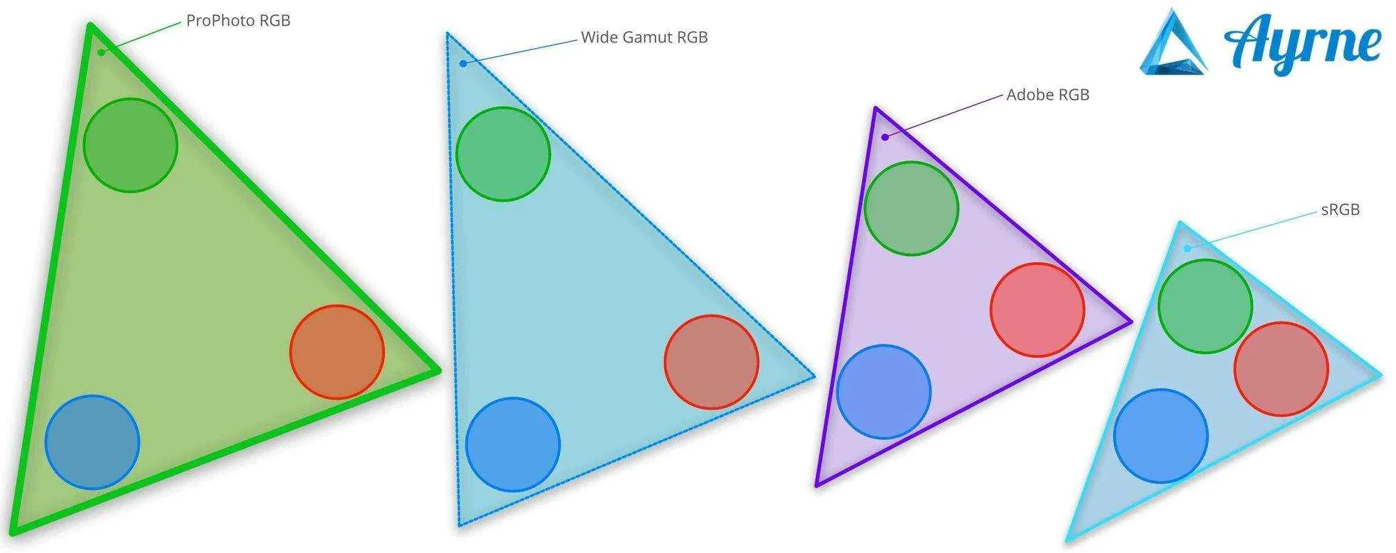
Now, for the sake of simplicity, imagine that each color space has just three colors – red, green, and blue (instead of the 256 variations of each of these colors that all 8-bit RGB profiles actually have). Think of each color gamut as containing slightly different hues of those three colors, as pictured in the image above. When you open an image in an application, the application needs to know which color space the image was created in so that it can accurately render the colors of your image. This is where an ICC color profile comes into play. The ICC color profile is embedded into your image and tells the software that is reading it which gamut of colors the image should be displayed in.

To make understanding ICC color profiles easier, I’ll personify them with a new, ultra colorful, cartoon super hero I just created that I’ve named “International Color Champion Woman,” or “ICC Woman” for short. While in the graphics world, ICC really stands for “International Color Consortium,” we’ll run with the idea it’s a super hero acronym for now.
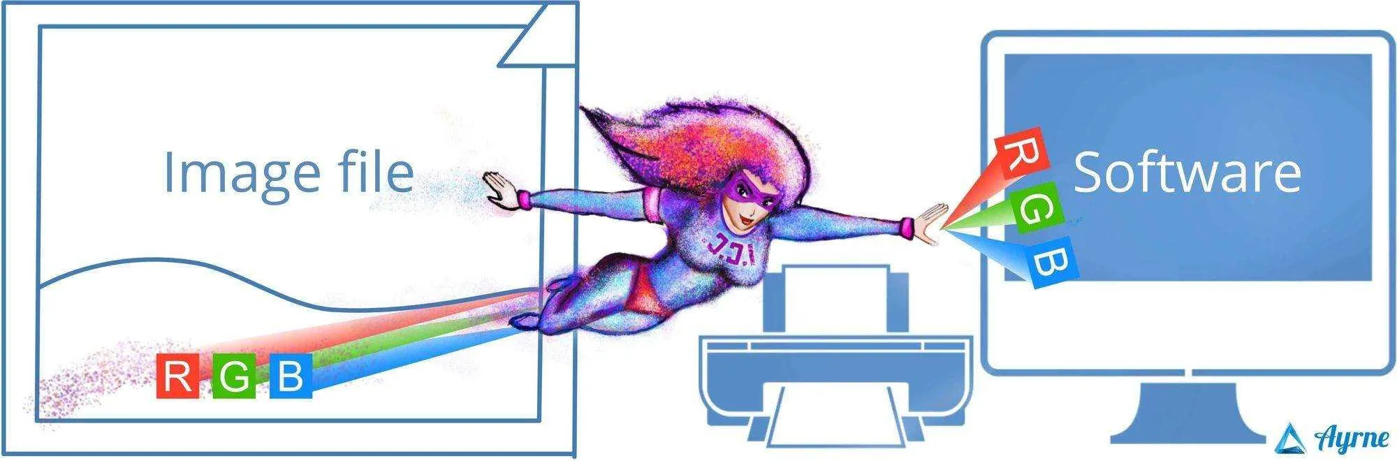
What does ICC do? It hides out in your image files waiting to leap into action and communicate the correct hues of red, green, and blue to any application, device, or printer that requests them. ICC has one job and does it unfailingly well, except when:
- The individual who set the color profile had no idea what they were doing. As an example – someone assigns an sRGB profile to an Adobe RGB encoded image and thinks that they’ve “converted” it. The result – gross looking colors.
- A device or application doesn’t have the ability to read the color space that ICC is trying to communicate. Many browsers will convert any image that isn’t in sRGB over to that profile and most do an awful job of it. The result – nauseating looking colors.
Meet CIE, the Human Visible Spectrum of Color
Meet CIE, the Human Visible Spectrum of Color
For all intents and purposes, you can think of the CIE color space as the great granddaddy of all color spaces. It’s going to be relevant to the chromaticity diagram we look at below because all other RGB color spaces are essentially a slice of this one.
Color Profiles in Images Explained
When you take a picture with a camera in JPEG, it will capture colors within whatever RGB color space it’s configured for and associate a ICC color profile with the image file so that software knows how to read those colors accurately. Many cameras let you select which color profile you want to use in their settings menus. The same is true for when you scan an image. When you save an image in an application, it will also use whatever color space it is configured for and embed a color profile into the image file when you export it. Most professional level image editing software will allow you to choose which color space you work in and which color profile your image is saved with. Some image editors will also allow you to convert or assign a color space to an image that already has one.
Some people, like myself, prefer to work with RAW files. RAW files don’t have a color space at capture, so it’s set by your RAW editor of choice when you open a RAW file to edit it. Despite the fact that higher bit-rate RAW files are capable of holding even more color information than even the CIE color space can encompass, if you’re exporting to JPEG, the end result is going to be that color data is lost unless you’re using sRGB as your editing profile.
When you open an image to view it, multiple color profiles come into play. Your monitor has it’s own unique color profile set at an operating system (OS) level that tells your graphics card how to best render the color data that it sends to your monitor. This works in the background regardless of whatever software you’re using, or what you’re viewing, to insure a consistent viewing experience on your device. Some image editors have several color profile settings. For example, some editors allow you select a color profile for displaying images that is separate from your workspace color profile and your export color profile.
Bigger Isn’t Better When it Comes to Color Gamuts
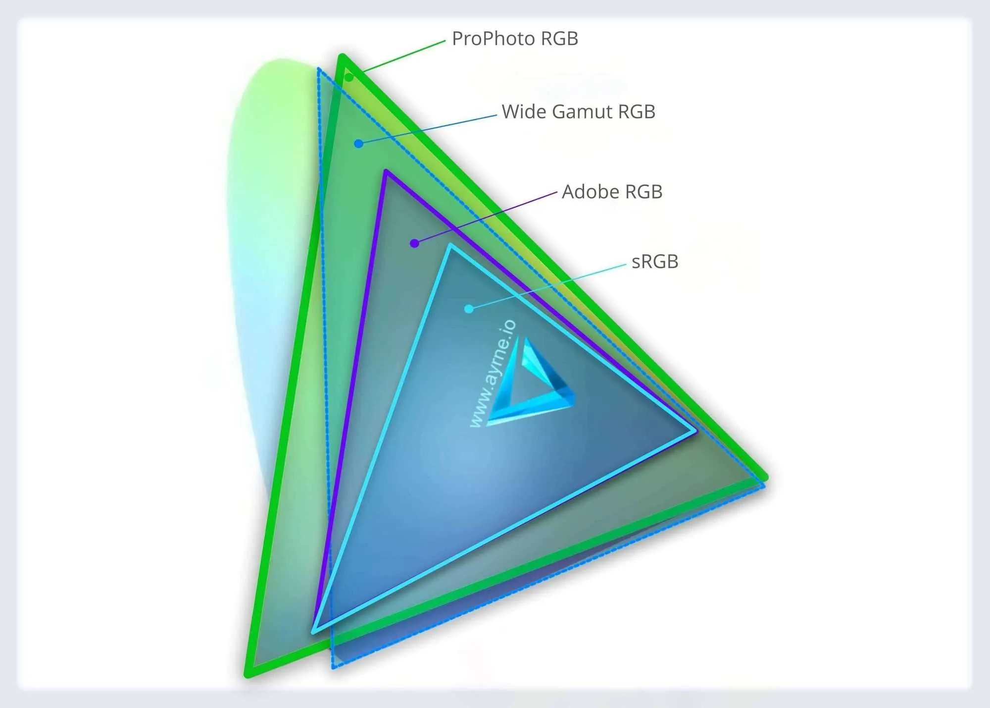
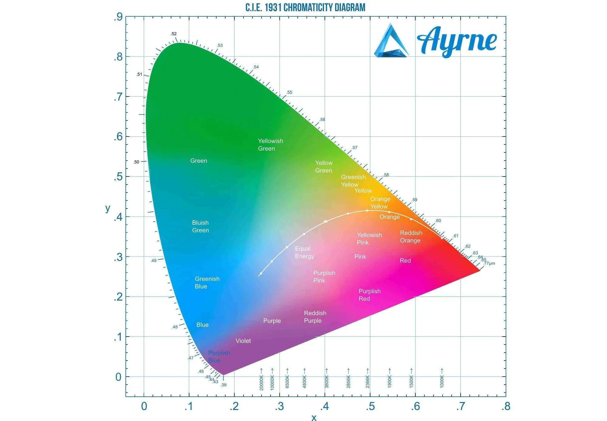
A source of some major confusion for many is the notorious chromaticity color spaces diagram. Many a decent well intended person has gazed long and hard at a chart like this one only to wrongly conclude that some RGB color profiles have “more colors” than others. It’s an easy enough mistake to make, especially when it’s posted on so many blogs and forums without any sort of context, or worse yet, has lots of bad information surrounding it.
In reality, Every 8-bit (24-bits per pixel) RGB color space has exactly the same number of color possibilities – 16,777,216 to be exact -or- for the sake of simplicity, we could just call it about 16.8 million. As an interesting side note, your eyes can only see 10-million colors, meaning, 8-bit RGB supports up to 6.8-million colors that your eyes can’t even see.
The same is true of the 16-bit (48-bits per pixel) RGB color space where color possibilities soar to 248 (two hundred eighty-one trillion, four hundred seventy-four billion, nine hundred seventy-six million, seven hundred ten thousand, six hundred fifty-six). You don’t need to worry about that though, since only a handful of ultra-expensive video cards and monitors will even display anything over 8-bits. So while your photo editor might be set for a 10 or 16-bit work space, you’re still seeing it in 8-bit color and so is the vast majority of the world’s population for the time being.
Which Color Profile Should I Use for My Images?
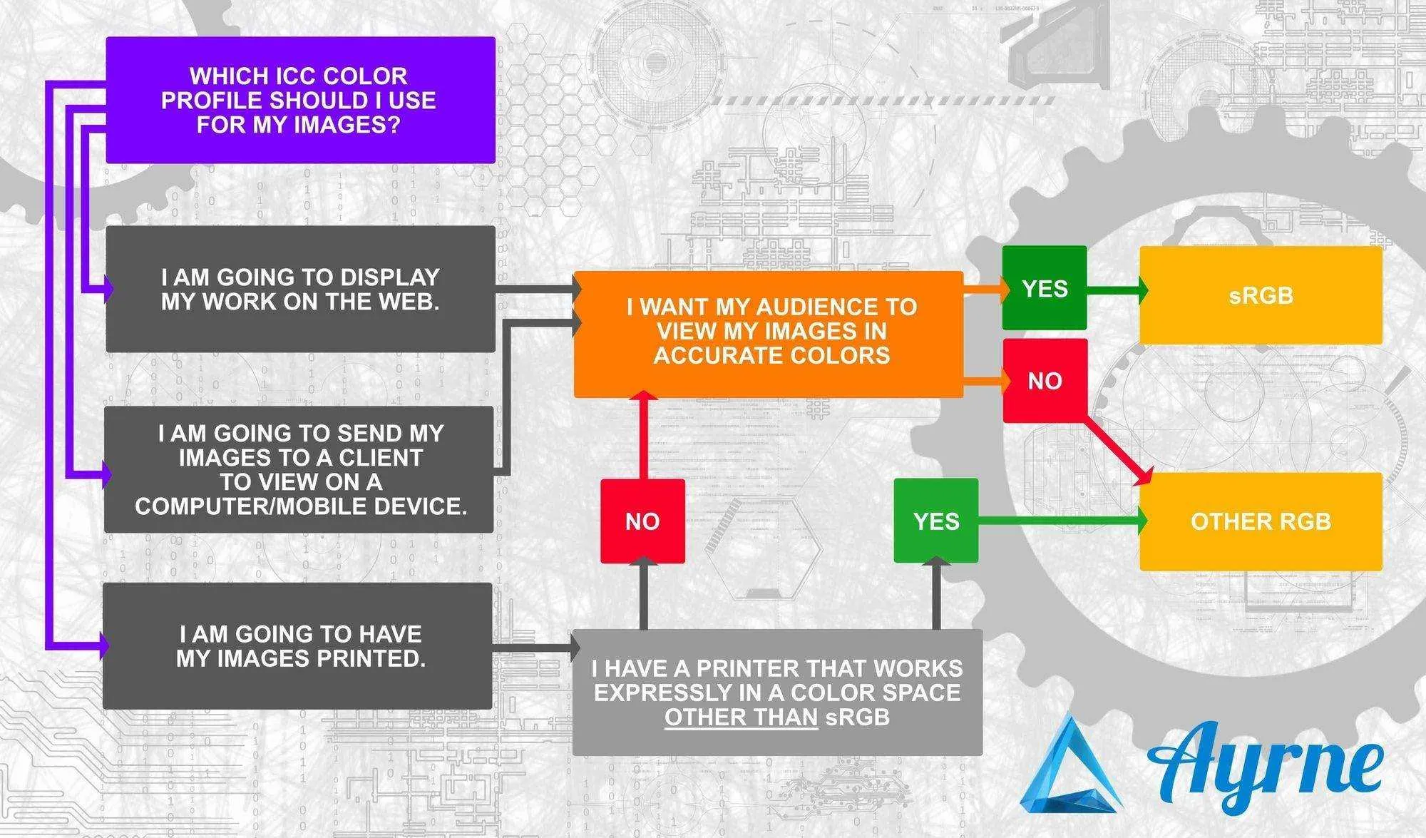
Not sure which color profile to use? I created the simple color profile selection flow chart (pictured above) to help photographers and graphic designers make that decision with ease.
Why sRGB is Actually a Better Choice for Standard Tasks
The fact sRGB was adopted as the standard by the the IEC and is actively maintained by the ICC is what makes it special. It’s the default color space of both Windows and Linux. It’s the color space of the web, the standard to which the vast majority of TVs, monitors, mobile displays, and other visual devices are created. It’s also the color space that majority of photo labs use as a basis for printer calibration. Printing companies like Kodak, Shutterfly, Fujifilm, Photobox, SmugMug, Amazon, WHCC, Bay Photo, Mpix, EZ Prints, Costco, Snapfish, Wolfe’s, and more all rely on sRGB as their standard for image printing. If your image isn’t in sRGB, many printing companies will convert it (I’ll get into why it’s better to start with sRGB than converting to it in just a bit).
- sRGB is the universal standard. It looks great across all devices all the time and it displays your image colors faithfully.
- 8-bit sRGB contains the same 16.8 million color possibilities of every other RGB color profile.
- The colors in sRGB are more concentrated so your images can display better subtle color variations and smoother color transitions for better gradient results.
A Few Words of Caution Regarding Wide Gamut Color Spaces
- If you don’t know exactly why you need a wide gamut color space, you shouldn’t use it. Period.
- If your device isn’t capturing images in a wide gamut color space, converting over to one can potentially cost you millions of subtle color variations.
- Having a monitor that supports a wide gamut color space doesn’t mean you need to export your images in that format. You can simply set your monitor and imaging software to display in that color space while using sRGB for your workspace and export color profile.
- While wide gamut color space encoded images may look good to you because you’ve got an ICC profile installed for displaying them, the vast majority of your audience may very well be seeing gawd awful looking colors.
- Having a printer that “supports” a wide gamut color profile doesn’t mean that you’ll get better image quality if you use it. In some cases “supporting” wide gamut might mean your printer simply converts wide gamut over to sRGB (and we already talked about the risks you run there). Unless your printer was explicitly designed for a wide gamut color space, I recommend using sRGB.
Myth: Starting with a Wide Gamut Color Profile Then Converting to sRGB Yields Better Image Quality
Converting an ICC profile isn’t down-sampling. Not only does starting with a wide gamut color space not magically create more colors out of thin air when you convert it over to sRGB, it can actually cause you to lose millions of colors from your image. It makes perfect sense if you think about it for a second. As we already discussed, each space contains colors that are totally unique to it. By necessity, many unique colors will be dropped during conversion. This is exactly why I set my camera to capture in sRGB and I edit in sRGB. With zero conversion comes zero color loss.
Myth: sRGB isn’t Good for Prints
The idea that sRGB isn’t good for prints simply isn’t true. In fact, sRGB is just about as much of a universal standard for printing these days as it is for the web. According to SmugMug:
The printers in most commercial labs[…]have a similar color range to the sRGB color space. Most of them expect your file to be in sRGB, and, if it isn’t, your prints will look washed out.smugmug.com
If you’re prints came back looking good despite using a wide gamut profile, it’s quite possible that the company you used converted them automatically over to sRGB when they were uploaded. Many print services do this to insure that your images don’t end up looking like hell. As I’ve already established though, you lose some of your image quality in this translation process.
Myth: Color Profiles Are Color Filter Effects
While it’s probably going to sound crazy to some, the fact is, there are people out there who seem to think color profiles are intended to be used as a sort of color filter effect that you apply at export. While doing this will definitely change the color appearance of your images, it’s in no way shape or form what a color profile is meant to be used for.
Myth: sRGB is in Competition with Other RGB Color Profiles
There are loads of articles out there bearing fighting word titles along the lines of “Adobe RGB versus sRGB,” “ProPhoto RGB vs sRGB – Which One is Better?” or “Wide Gamut RGB versus sRGB: The Ultimate Take Down.” While as a technical person I can totally understand how easy it is to fall into this numbers and comparisons trap, it’s not really an objectively comparable arena. SRGB is the universal standard. If you want people to see your images in the correct colors, you use it. All other color profiles exist for highly specific applications and contain colors the vast majority of the world won’t be able to see unless they’re produced/reproduced on special equipment. Trying to create a battle of color profiles is a lot like a flute and dog whistle matchup or pitting a standard box of crayons against a highly specialized one developed for viewing by mantis shrimp – yeah, it’s silly.
Myth: Converting an Image to sRGB “Ruins” Color Rendering
Another wide spread rumor is that converting images to sRGB results in “bad color rendering.” While you do definitely lose color information when you convert from one profile to another, it’s largely an undetectable and subtle loss. In some cases people are simply using software that isn’t good at converting color spaces. In other cases the problem is user error and the people who claim this aren’t really “converting” the images over to the sRGB color space. What these people are actually doing is assigning an sRGB profile to an image that is in another color space. In the example image above, I show how results differ between converting an image from Adobe RGB and assigning an alternate color profile to it. The top row of converted image colors remain acceptably true across the board, while in the bottom row, you can see that sRGB looks faded and ProPhoto looks pretty insane.
Myth: Switching an ICC Profile Magically Transforms Your Image Into One Captured by Another Camera
I know this one’s extra specially crazy, but I’ve seen it stated as a fact out there on the internet and applauded by a small group of loyal, if not horribly misinformed supporters. Let’s say you have a Sony camera and you convert the ICC profile on one of your images over to (for example) Agfa or PhaseOne – this does not magically transform your image into one that was captured by said camera manufacturer. It displays your camera’s image colors incorrectly in the other manufacturer’s color space and nothing more. There is software out there that lets you replicate film, but there’s nothing that’s going to let you replicate a camera. If that was the case everyone would just shoot photos with their smartphones and upgrade them to a high-end full frame or medium format camera via a color profile.
Myth: sRGB is Older/More Outdated Than Other ICC Profiles
I’ve seen it suggested a lot, particularly by Mac users, that sRGB is “old” and “outdated,” and Adobe RGB is somehow “the future” of color profiles. The irony here is that Adobe RGB often contains “1998” in its title, yet few would assume that Adobe hasn’t touched it since then. At any rate, despite being first created in 1996, sRGB is actively in development and ever evolving as the global standard for imaging. For those who haven’t noticed, the version that most software is using right now is 2.1. There’s a beta version 4, and there’s even an ICCMax version in development that’s looking to solve many of the color space woes of the world. When you realize that there’s global organization meeting regularly on the future of sRGB and that virtually every electronics manufacturer with a product that features any kind of visual display relies on it, it’s hard to imagine anything that could be more updated or current than sRGB.


