The Mystery of Sigma's 85mm DN Pincushion Distortion
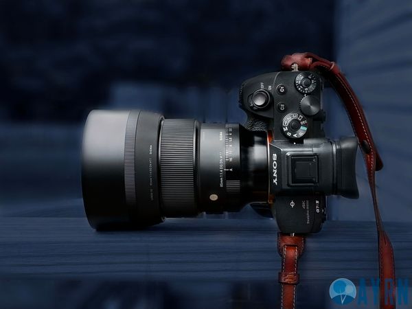
I recently reviewed Sigma's new 85mm f/1.4 DN Art. During the image quality part of the review, I noticed that the new lens had a surprising amount of pincushion distortion. Now, don't get me wrong - it's easily correctable in post and Sigma's new lens is still overall the best 85mm I've encountered for Sony full-frame e-mount, But it was really odd to see pincushion on an lens of its focal length. In fact, I've never encountered it before.
Want to say thanks for an ad-free, subscription free experience and top-notch content?
 Buy
me a coffee
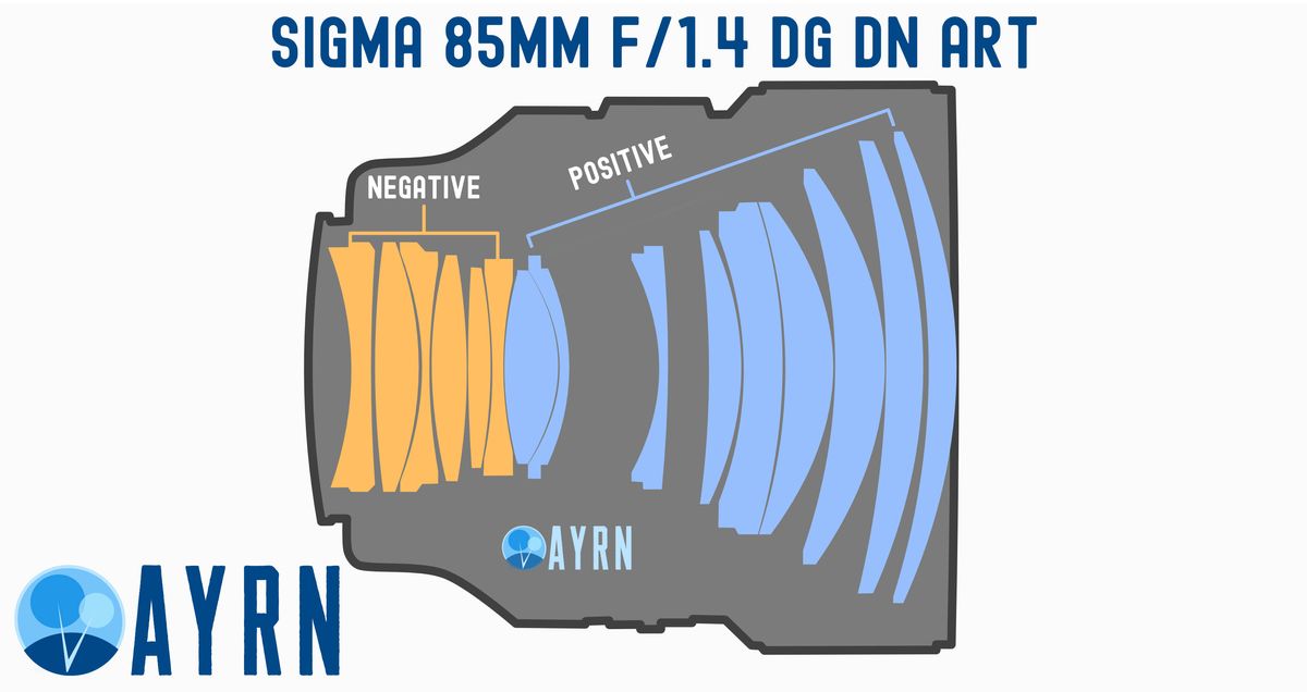
While writing my thoughts on the optical design for the review, I had a sudden epiphany that seemed to give me the missing piece of the puzzle that I had been looking for. Sigma appears to have gone with what's called a "positive, negative" formula, or more commonly, a telephoto lens formula. It's worth noting here that "telephoto" has become synonymous with a long lens, but traditionally, and more accurately, it means that special optical elements have been implemented so that the lens can be shorter than its focal length. In other words, an 85mm lens is going to be be at least 85 millimeters long unless some optical "magic" is done by the lens manufacturer. One such form of magic, is the telephoto optical design.
If the hot-shoe fits...it's telephoto lens distortion
So now that I've explained what a telephoto lens is in a formal sense, I'm going to help those of you who aren't lens design nerds visualize it too.
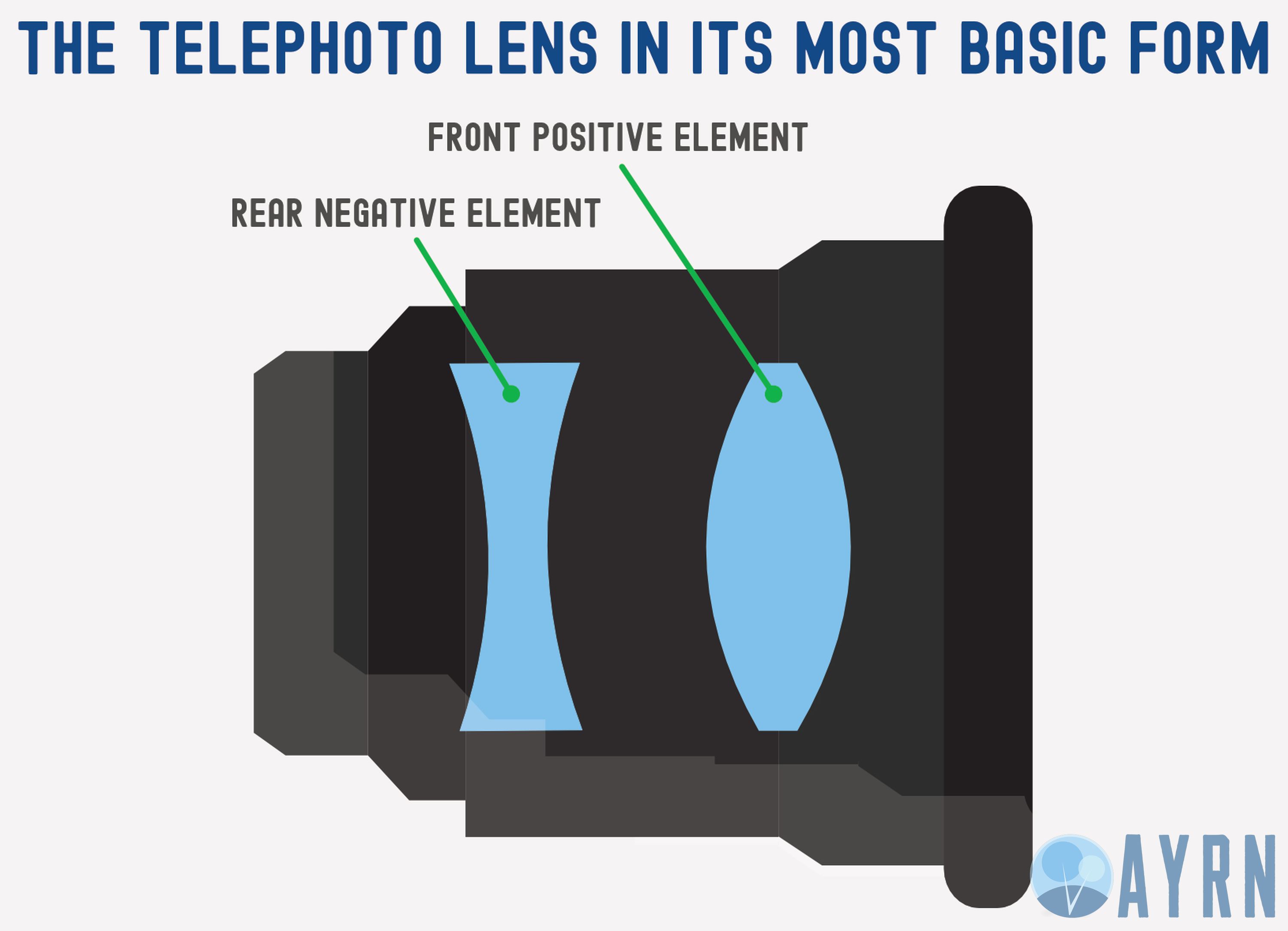
If you look at the nifty diagram I created above, you'll see what a telephoto lens formula looks like when its reduced to its most simplistic two element form. From here, it can get massively more complex, but to make this as easy as possible starting out, I've stripped out all the fluff.
On the back, you've got what's called a biconcave (or double-concave) element and on the front, you've got a biconvex (or double-convex) element.

As you can see in our second colorful illustration, the front element concentrates the light that passes through it onto the back element which then expands the light onto your camera's sensor. Together these two elements, combined in this sort of way, make the image closer to the subject (more zoomed in looking) than it would otherwise be without them.

Which brings us to Sigma's new 85mm Art lens and it's rather odd pincushion distortion. If you look closely, you'll probably see the double-convex formula in the front part of the lens followed by the double-concave formula at that back end of the lens. While I'm not a lens designer, I've read tons about the subject and I'm pretty gosh darn confident that this is a telephoto lens design. And remember the light diagram we looked at earlier? All that concentrating and expanding leads to pincushion distortion, of which the Sigma 85mm DG DN Art has a lot.

Here's an example of what I'm talking about. See how the image looks as if someone behind it has grabbed the center and is stretching it back? That's called pincushion distortion.

Of course, as you can see here, moving the distortion slider in post totally cleaned it up and it looks perfect now.
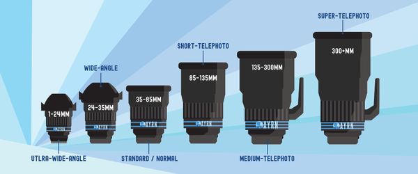
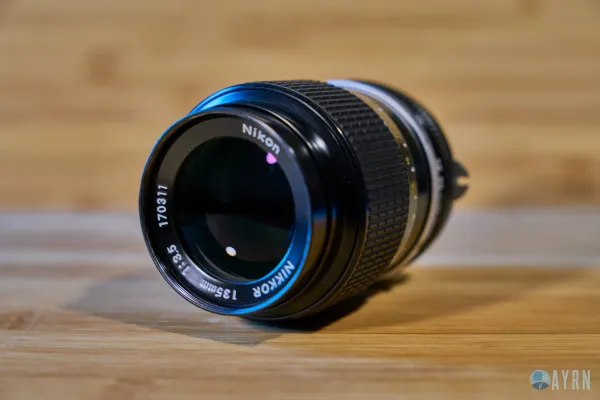
Most lenses over the 135mm focal length use a telephoto formula, but it's not common in 85mm lenses, nor is heavy distortion. That's why I was kind of surprised when I saw it there.
The telephoto optical design has been around for ages. It was first introduced in the 1890s and it's been popular in long focal range lenses ever since. On occasion, it's also used in designs where a manufacturer wants to shrink a lens design down "honey I shrunk the camera" style. Here, we see that Sigma appears to have cleverly employed this optical tactic to make their amazing new 85mm Art lens super duper compact.


